Web Design
•
Quick Takeaways
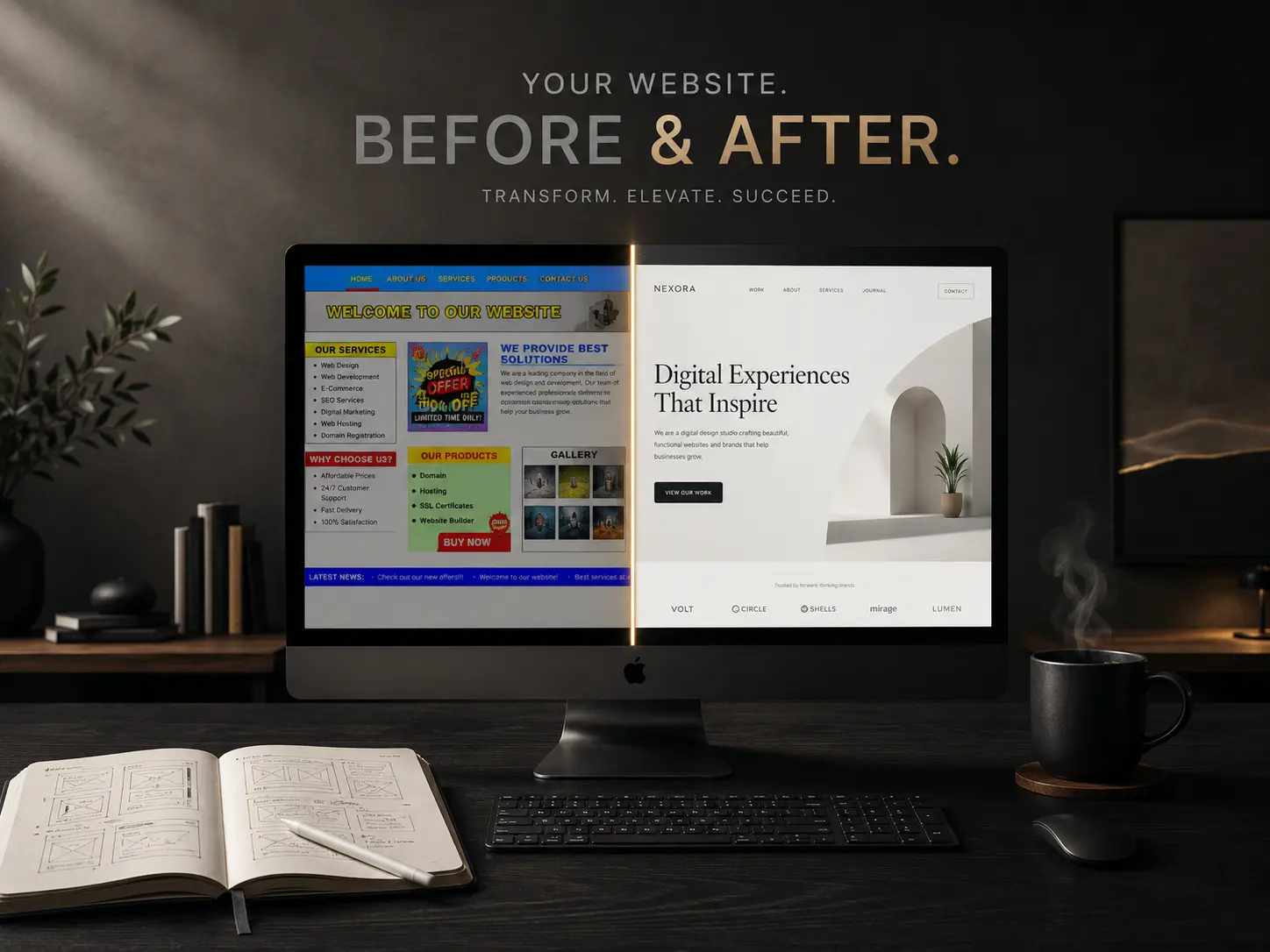
Visitors form an opinion about your website before they read a single word of your content.
Premium websites feel intentional, not complicated.
Trust is shaped as much by digital perception as it is by the actual quality of your services.
A premium online experience is built through hundreds of thoughtful decisions, not an unlimited budget.
A website designed with "Quiet Confidence" fundamentally changes the sales conversation, shifting prospects from price-shopping to value-seeking.
The Feeling You Can’t Quite Explain
There are websites you forget moments after closing the tab. Then, there are websites that stay with you.
Not because they were louder. Not because they were packed with dramatic animations. Not because they looked expensive. But because they felt expensive.
You notice it almost immediately. The typography feels effortless to read. The spacing gives every element room to breathe. The imagery looks like it belongs to one carefully crafted brand instead of five different, disconnected stock libraries. Nothing competes for your attention, yet you instinctively know exactly where to look next.
Most people can’t explain why those websites feel different. They simply trust them more.
And that feeling is exactly what separates an ordinary website from one that quietly builds confidence before a single word has been read.
The Surprising Truth About "Premium" Design
Many business owners assume that creating a premium website is simply a matter of spending more money. They believe that a higher budget automatically translates to a higher-end feel.
It doesn’t.
Some of the most refined websites on the internet were built through disciplined design systems, clear strategy, and obsessive attention to detail—not unlimited budgets. At the same time, businesses frequently invest heavily in redesigns, adding layers of complex code and flashy features, only to end up with websites that still feel generic because consistency was sacrificed along the way.
A premium website isn’t created by adding more. It’s created by removing uncertainty.
Why This Matters More Than Ever: The First Impression Economy
Today’s visitors make decisions faster than ever. Before they compare pricing, before they read your testimonials, and long before they fully understand the nuances of your services, they are already deciding whether your business feels credible.
That micro-second first impression influences everything that follows.
A visitor who inherently trusts your website reads your content differently. They interpret your expertise more positively. They are more forgiving of small friction points. They are more willing to continue exploring. Most importantly, they are significantly more likely to enquire.
Your website isn’t simply presenting information. It is actively shaping perception.
What This Guide Covers
Rather than focusing on fleeting visual trends or chasing the latest design fad, this flagship guide explores something much more valuable: the strategic foundations of trust.
You will discover:
The Business Value of Perception: How a premium digital experience directly impacts your bottom line.
The Framework of Quiet Confidence™: Why simplicity and intention outperform complexity.
The Anatomy of Hesitation: How small inconsistencies quietly damage your credibility.
The Five-Second Exercise: How to evaluate your own website through the ruthless eyes of your visitors.
By the end of this guide, you won’t just understand what makes a website look premium. You’ll understand why people instinctively trust one business over another—and how to engineer that trust for yourself.
The ROI of Trust: How Perception Drives Revenue
It is easy to dismiss web design as a purely aesthetic pursuit. But in the modern digital landscape, aesthetics are economics. The way your website looks and feels has a direct, measurable impact on your revenue, your sales cycle, and your market positioning.
When your website feels outdated, cluttered, or inconsistent, it triggers subconscious alarms for the visitor. They begin to ask questions: Is this business still operating? Are they successful? Will their actual service be as disorganized as their homepage?
When a prospect lacks trust, they default to the only metric they have left to evaluate you: Price. They will put you in a spreadsheet next to your competitors and look for the lowest number.
However, when a website feels premium, the psychology shifts entirely.
It Shortens the Sales Cycle: Prospects arrive at the discovery call already pre-sold on your authority. You spend less time proving your competence and more time discussing their specific needs.
It Commands Premium Pricing: People expect to pay more for high-quality experiences. A refined website signals that you are an industry leader, justifying higher rates without the need for aggressive defense.
It Attracts Better Clients: High-end clients expect high-end touchpoints. If your digital presence matches their expectations, you naturally filter out bargain-hunters and attract clients who value quality over a discount.
The Framework of Quiet Confidence™
The businesses that create the strongest first impressions rarely have the most complicated websites. They have the clearest ones. They operate on a principle we call Quiet Confidence™.
In web design, there is "Loud Insecurity" and "Quiet Confidence."
Loud Insecurity is the website that begs for attention. It bombards you with a pop-up before you’ve even read the headline. It uses five different font weights to emphasize a point. It packs the navigation menu with 15 different links because the business is terrified you might miss something. It is design driven by the fear of losing the visitor.
Quiet Confidence, on the other hand, doesn’t demand attention; it earns it.
It resists the urge to explain everything at once. Instead, it focuses on communicating the right things in the right order:
A strong, definitive headline.
A clear, unambiguous value proposition.
Beautiful imagery that supports the message rather than distracting from it.
Stripped-back navigation.
Consistent typography.
Generous, intentional spacing.
Every element has a purpose. Nothing competes for attention because everything has already been prioritized.
Ironically, achieving this level of simplicity takes significantly more work than adding another section, another animation, or another call-to-action button. As the saying goes, simplicity is the ultimate sophistication. That is why brands like Apple and Notion feel effortless to use—every design decision is part of a larger, disciplined system.
The goal isn’t to impress visitors with how much you’ve added. It’s to reassure them with how intentionally everything has been designed.
Every Detail Is Quietly Communicating Something
Most business owners believe visitors judge them based on their services. In reality, visitors judge the presentation of those services first.
A perfectly aligned layout communicates attention to detail.
Generous spacing communicates confidence.
High-resolution, curated photography communicates authenticity.
Fast loading times communicate reliability.
Clear navigation communicates organization.
Conversely, inconsistent typography, cheap stock visuals, crowded layouts, and confusing menus create tiny moments of hesitation. Individually, these moments seem insignificant. A slightly misaligned button won't ruin a business. But collectively, these inconsistencies stack up. They shape how people perceive your brand before they’ve learned anything meaningful about what you actually do.
The quality of your work may be exceptional. But if your website doesn’t reflect that quality, visitors have absolutely no reason to assume it does.
The Five-Second Exercise
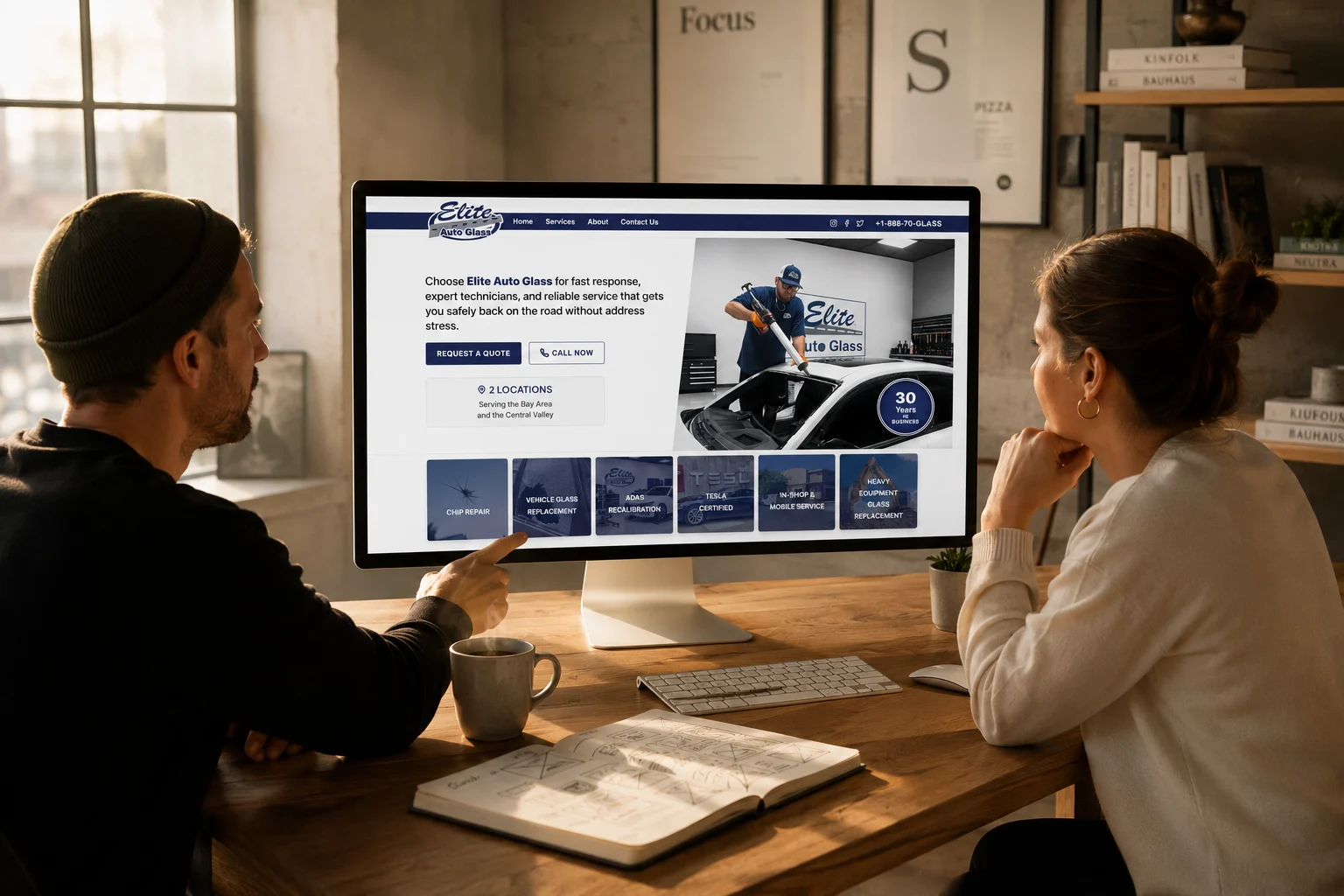
Whenever you look at your own website, you’re seeing it through years of familiarity. You know your services inside and out. You know your backstory. You know exactly where every button leads.
Your visitors don’t.
Here is an exercise we recommend to break that familiarity:
Open your homepage on your computer or phone.
Set a timer for exactly five seconds.
Imagine you have never heard of your business before.
When the timer ends, close the tab and ask yourself these questions:
Could I immediately tell what this business actually does?
Did the website feel inherently trustworthy?
Did the visual presentation reflect the actual quality of the service being offered?
Was there one clear, obvious next step to take?
If you hesitate on even one of those answers, your visitors probably do too. The key difference is that they don’t stop to analyze why they feel hesitant. They simply hit the back button and leave.
The Next Step in the Series
Understanding that people don’t experience your website the way you do is the first major paradigm shift. You now know that every font choice, every image, and every line of spacing contributes to a first impression that forms long before your content has the chance to persuade.
But how do you actually build that feeling?
Now that we understand the strategic and financial importance of a premium digital presence, it is time to open the hood. In the next part of this series, The Anatomy of a Premium Website, we will transition from strategy to execution. We’ll break down the specific, technical engineering behind Quiet Confidence, exploring the exact rules of typography, white space, visual hierarchy, and color that separate the cheap from the expensive.